Words
Identity & Graphic campaign for DEMO
Client: Adi-Fad & Demo. Barcelona, 2015
2014
Graphic Awards:
2015 Silver Laus (Integrated graphics)
2015 Bronze Laus (Promotional element)
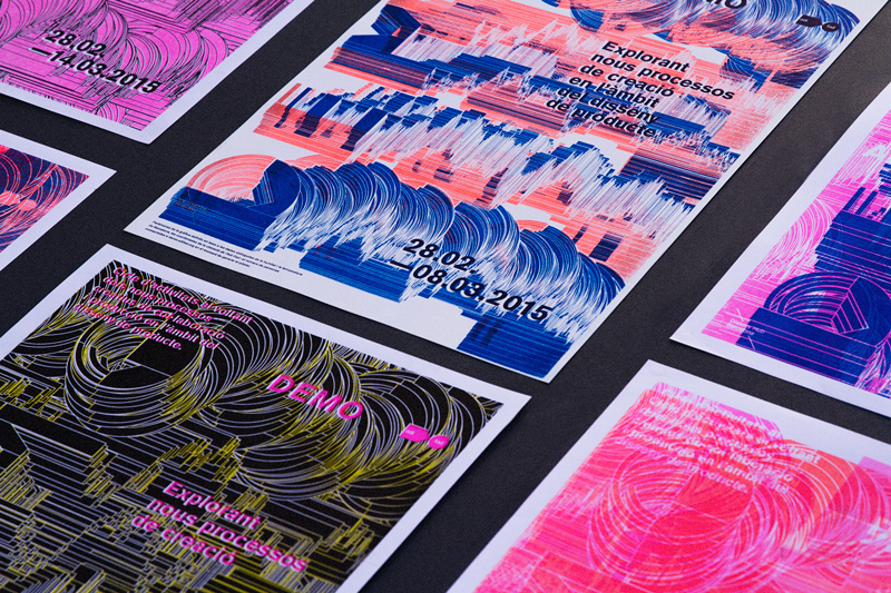
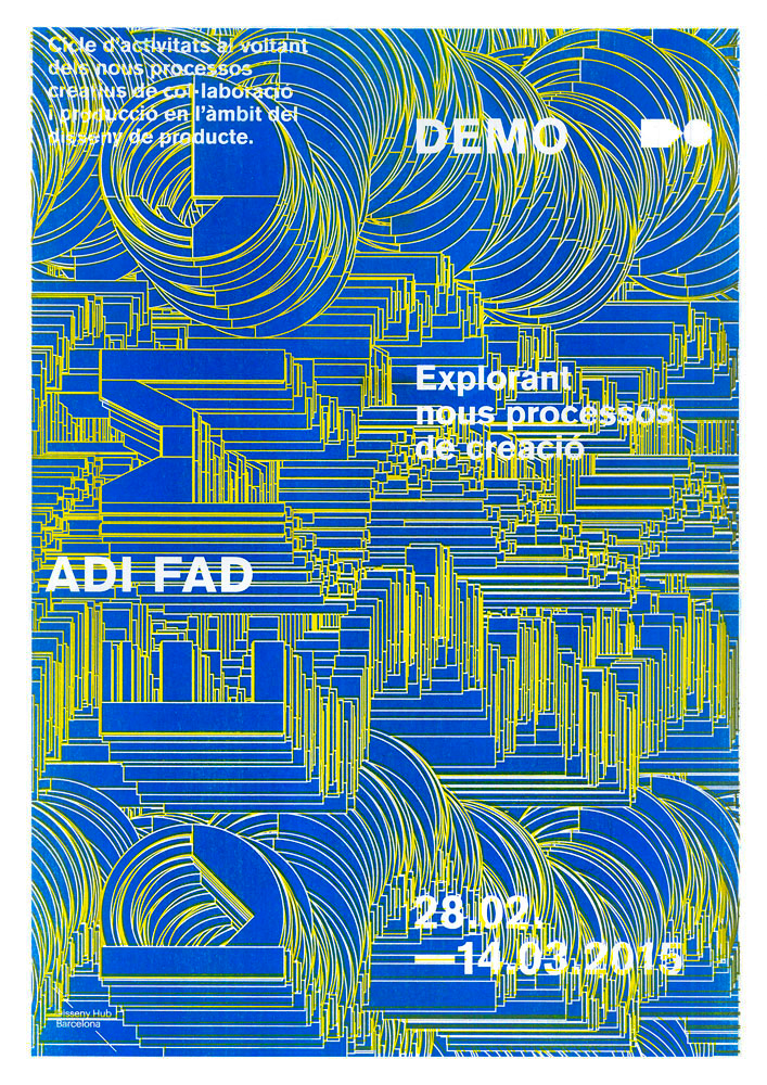
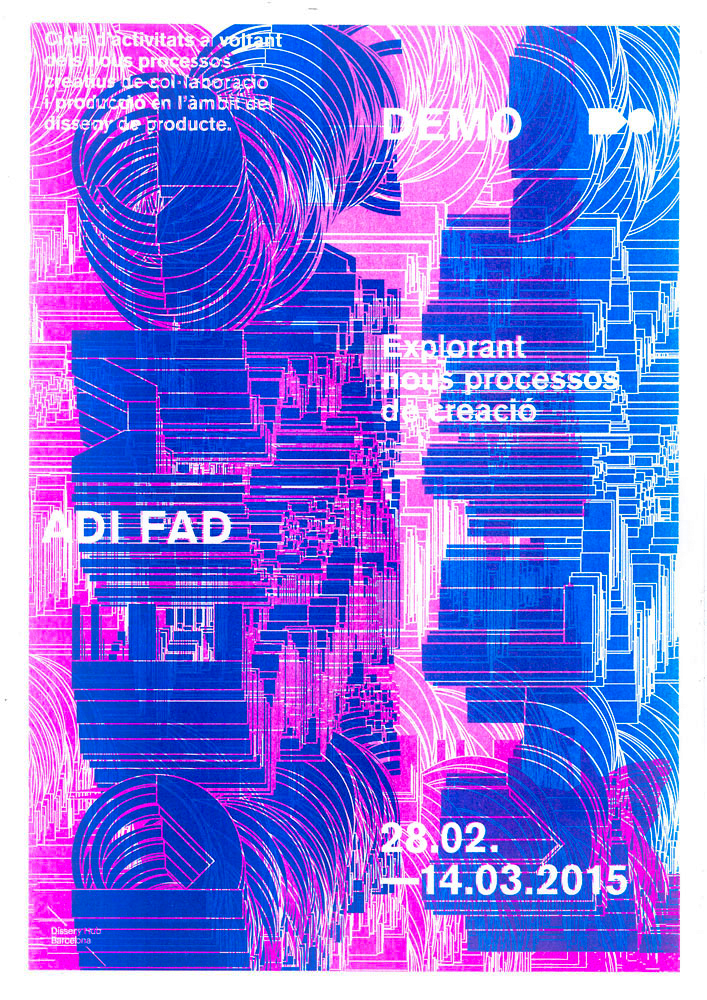
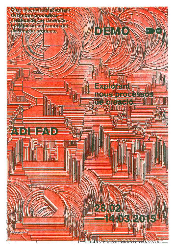
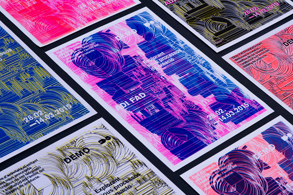
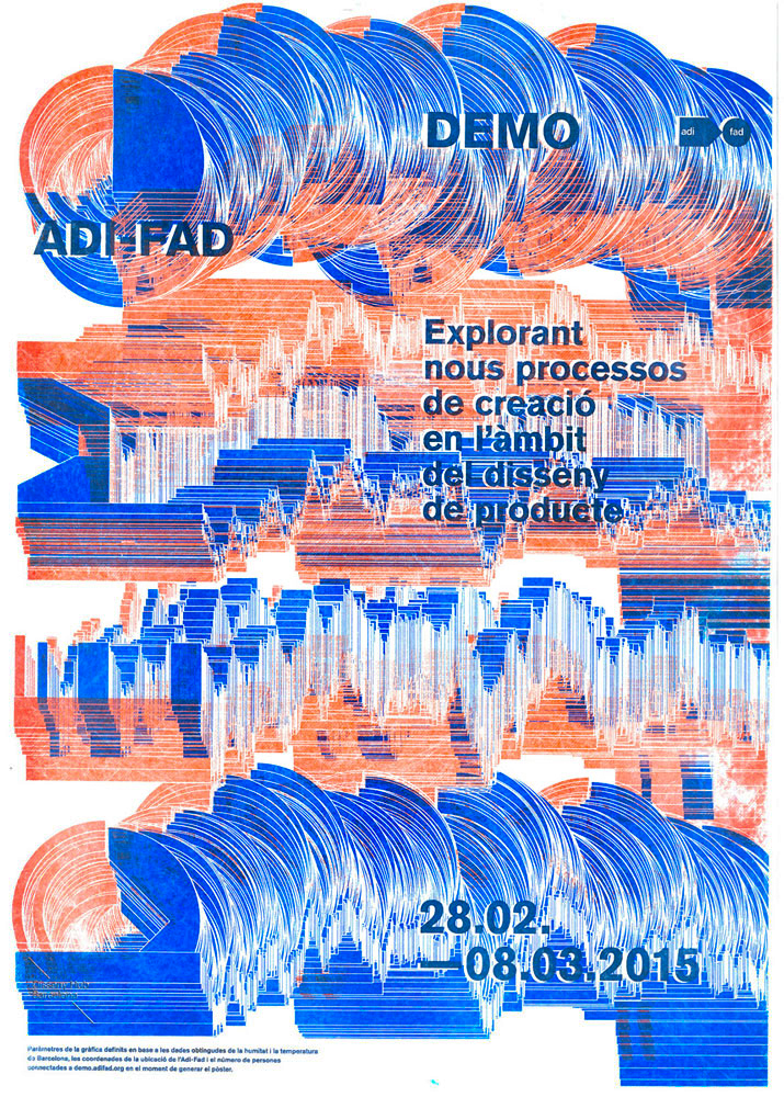
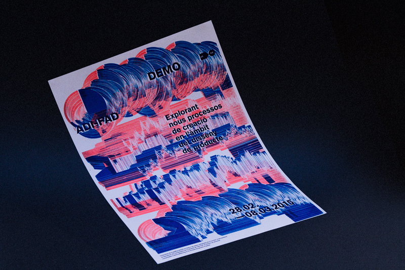
Graphic media campaign for Demo Design Festival with 3D printed modular type.
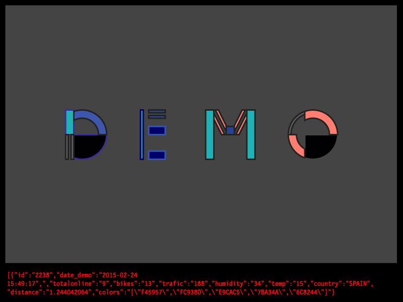
The identity created for the event “DEMO. Exploring New Creation Processes” was conceived as a “testing ground,” allowing an emphasis on the experimental processes of graphic creation and production, rather than just the final outcome.
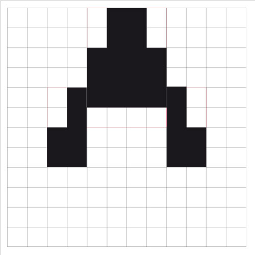
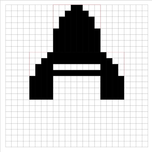
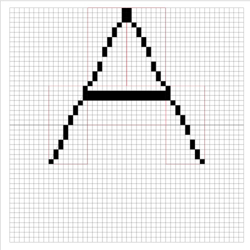
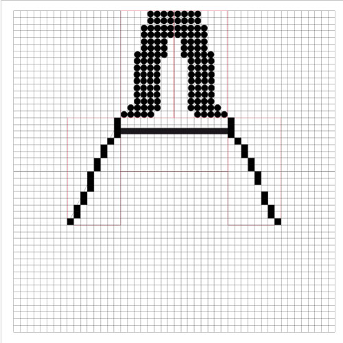
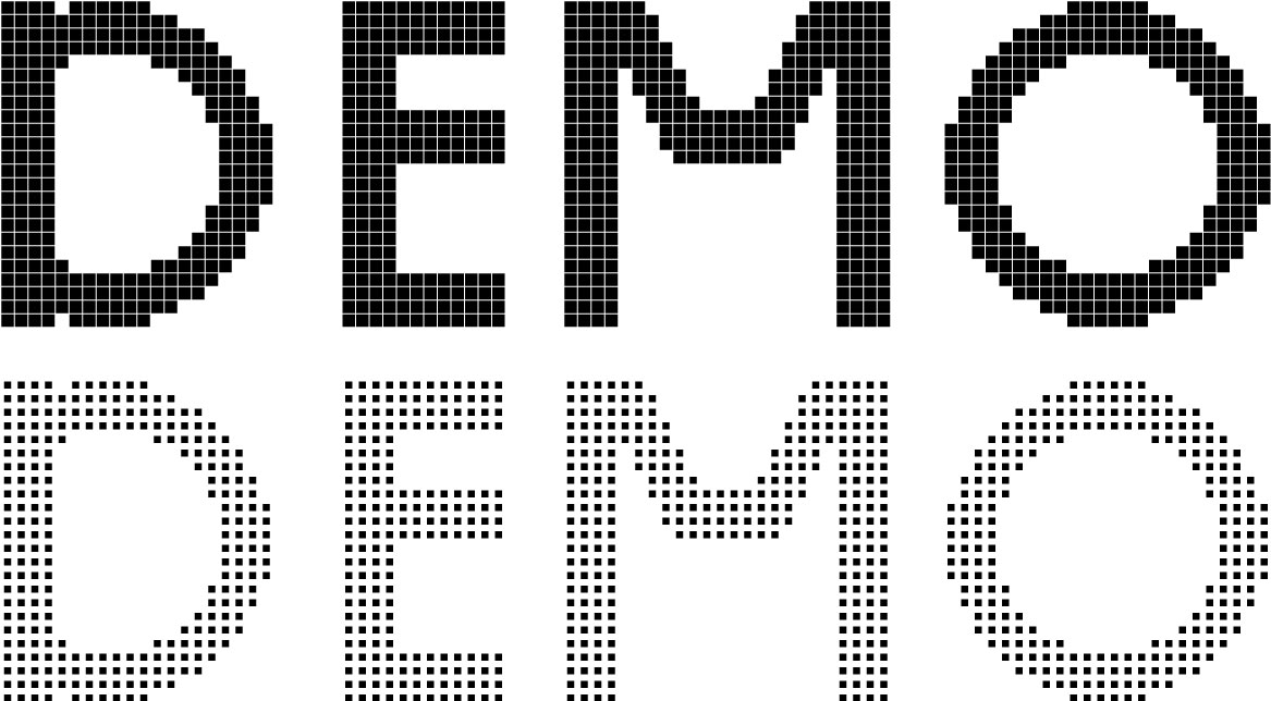
With the design of a modular-based typography, a highly flexible system was devised to combine analog and digital processes as the foundation of the event’s identity. This allowed for the generation of infinite alphabets and the use of a mix of high and low-tech tools for their application in creating/producing various graphic materials. These graphic “demos” showcase the result of combining different technologies such as 3D printing, collage, risography, and traditional four-color printing.
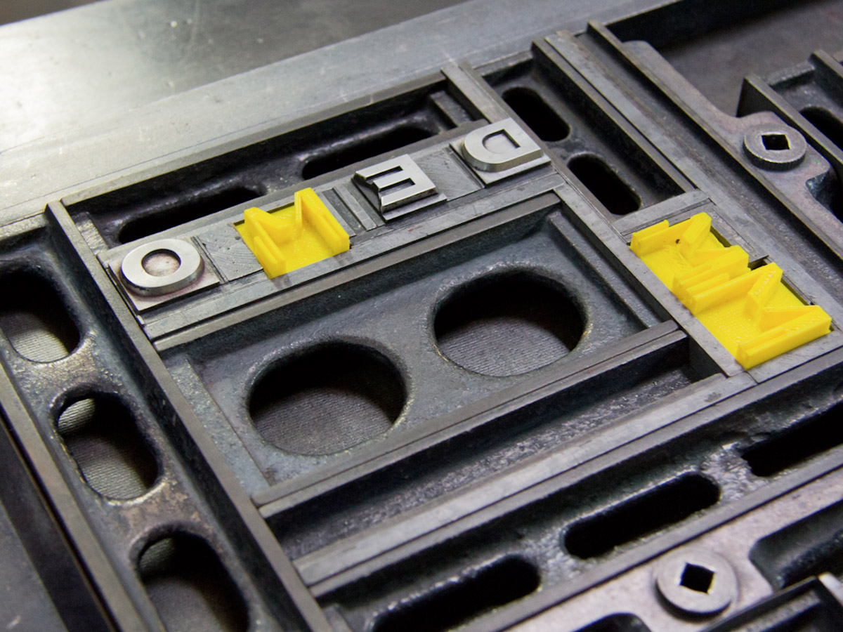
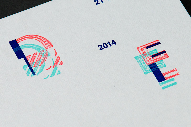
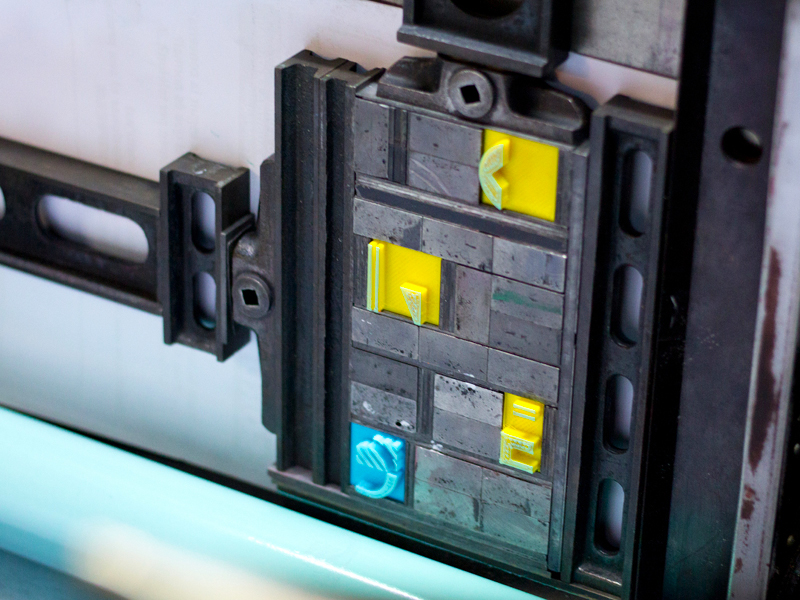
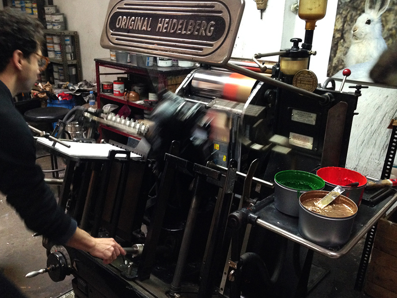
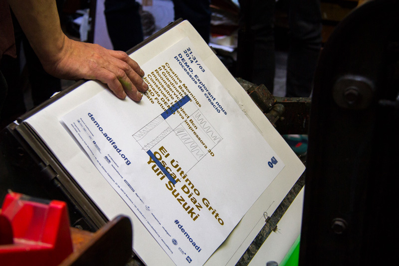
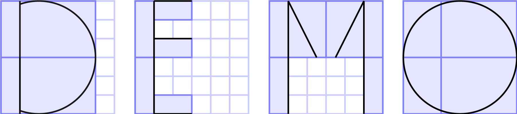
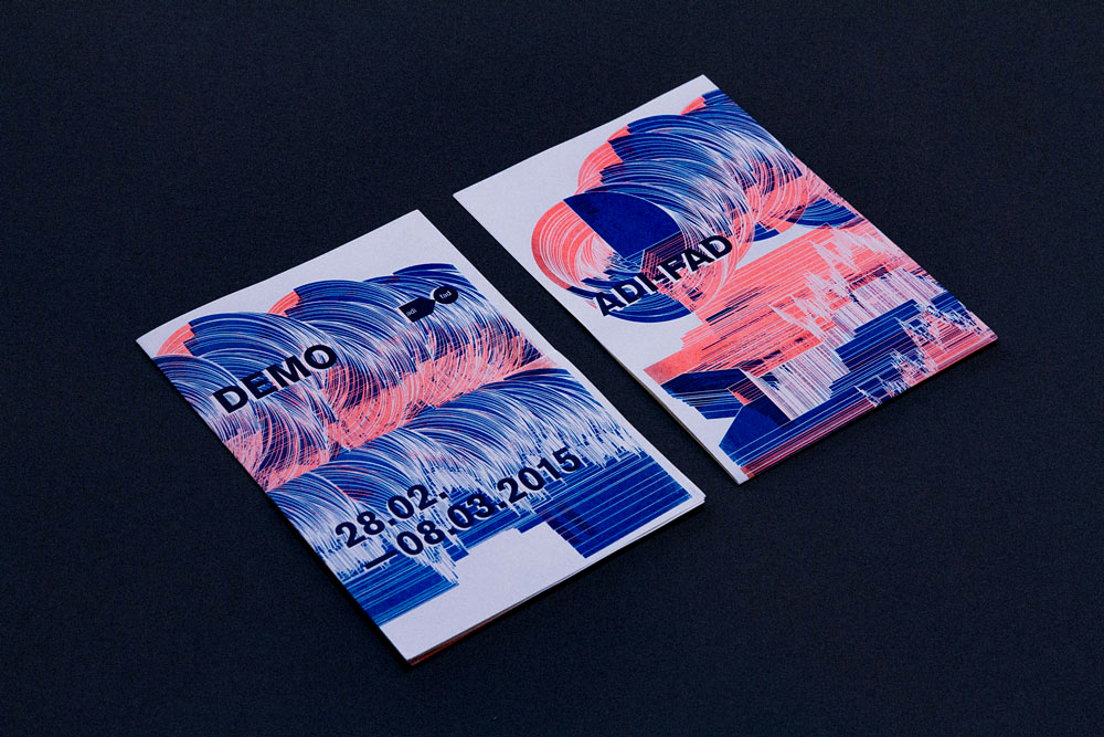
The initial application for DEMO is a graphic piece that combines shape generation using digital manufacturing technologies and the use of traditional analog printing techniques. The design of the four letters “D”-“E”-“M”-“O” corresponds to the modular typographic system designed to create the event’s identity. For its use in the postcard, each letter has been divided into several fragments, with some of them being printed as objects in plastic using a 3D printer and the remaining fragments being part of the overall layout of the piece (offset). The postcard was printed in the workshops of L’Automàtica, combining two printing techniques, Offset for the general layout (blue ink), and Letterpress (green ink) for the 3D objects, which have been integrated into the traditional movable type system and printed under pressure on a Heidelberg machine from the 1950s. An interesting detail to highlight is that the letterpress printing has resulted in a baroque texture as a residual pattern from the 3D printing, adding an unexpected graphic detail to the piece.
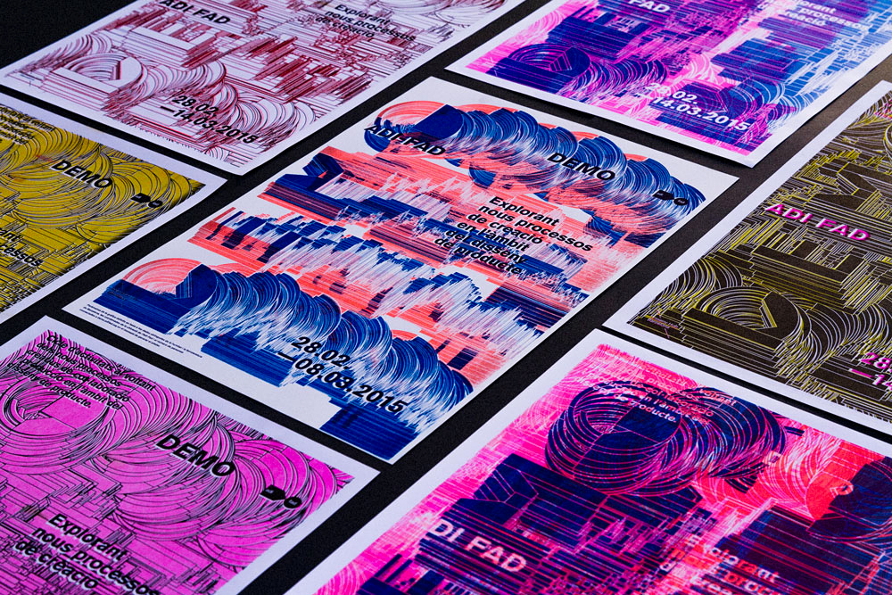
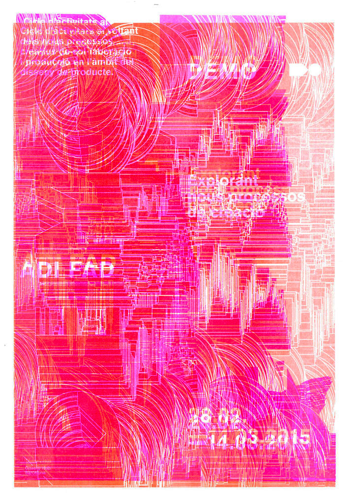
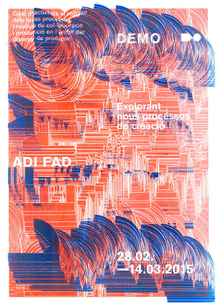
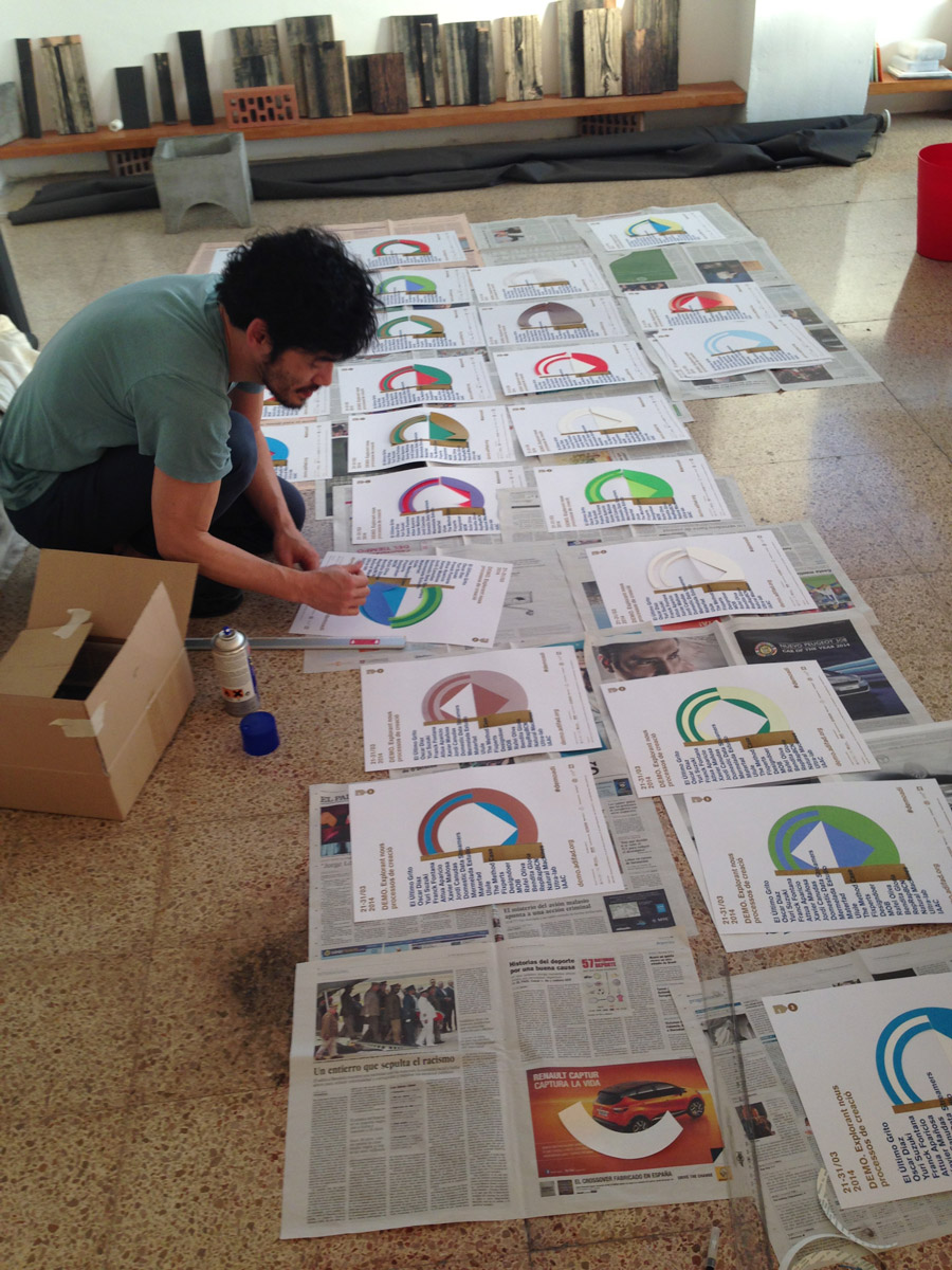
The posters were printed using risograph as the base. To complete the modules forming the letters of the logo, movable types in 3D printing were used for letterpress, collage, and risograph.
All graphic pieces were used as communication media – even with some errors – as a demonstration of the experimental nature of the event’s identity creation process.
2015
Graphic Awards:
2015 Silver Laus (Integrated graphics)
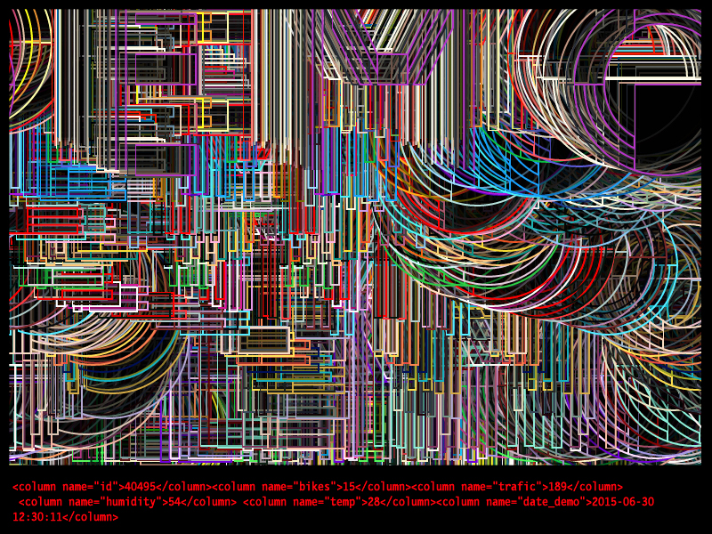
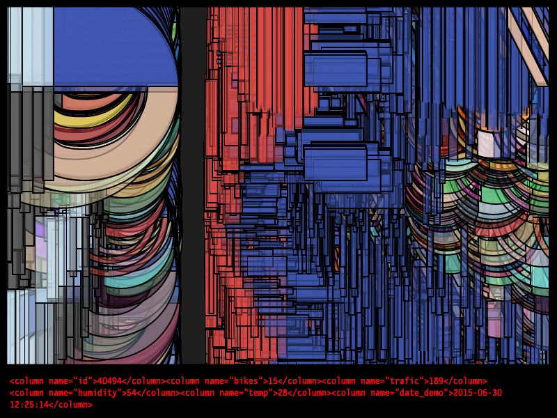
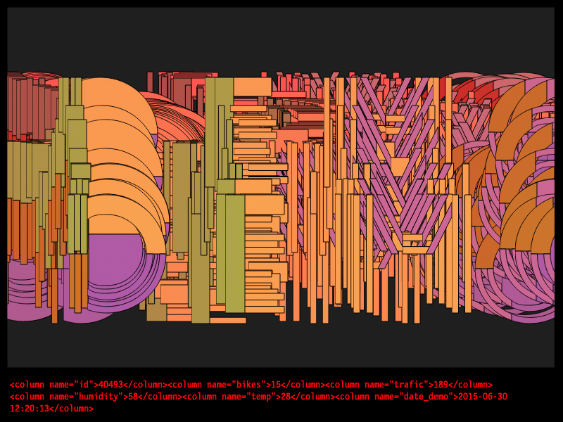
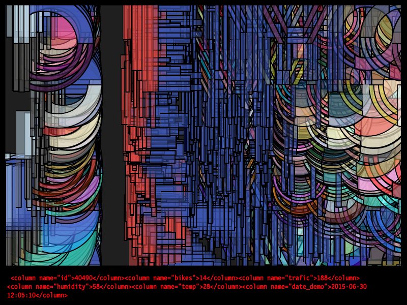
The brief was to create an experimental identity based on -Trial & Error for the festival. It had to be risky and esthetically complex, the expectations were to create something unique that could be use as example for the festival related to Internet of Things. The logo is result of extracted information from internet database. The typo is based on a modular system that allows a sort of materialization (in color and shape). Its nature also allows to modify the standard form interacting with its parts.
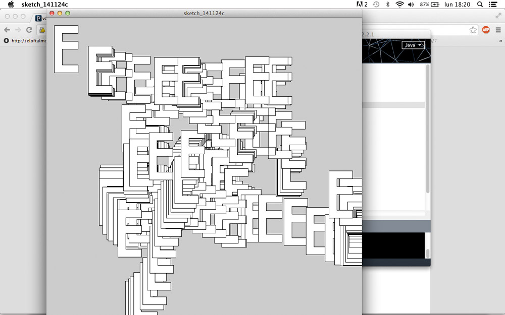
This graphic identity is connected to internet programmed by Javascript & Processing. Its nature is experimental, spontaneous, flexible & customizable.
Design Team: Kentaro Terajima + Raquel Quevedo
Code: Adrià Lopez, Joaquim Salat
The design of the four letters D-E-M-O corresponds to the modular typographic system designed to create the event's identity. For its application in the postcard, each letter has been divided into several fragments, with some of them separated to be printed as plastic objects using a 3D printer, and the remaining fragments are part of the overall layout of the piece (offset printing).
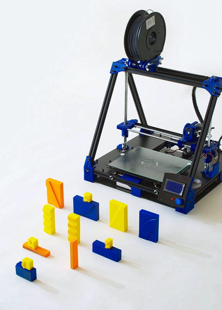
The postcard was printed in the workshops of L'Automàtica, combining two printing techniques, Offset for the general layout (blue ink) and Letterpress (green ink) for the 3D objects, which have been integrated into the traditional movable type system and printed under pressure on a Heidelberg machine from the 1950s. Notably, the letterpress printing has resulted in a baroque texture as a residual pattern from the 3D printing, adding an unexpected graphic detail to the piece. The posters were printed using a risograph (base). To complete the modules forming the letters of the logo, movable types in 3D printing were used for letterpress, collage, and risograph.
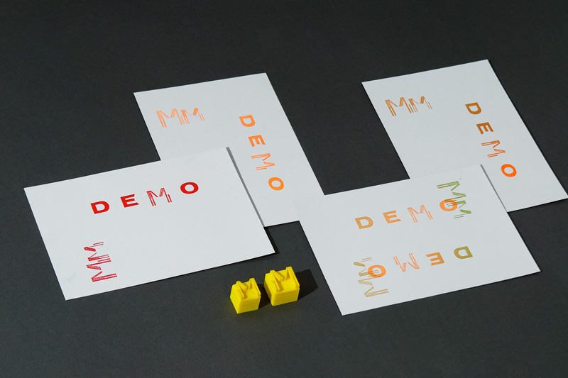
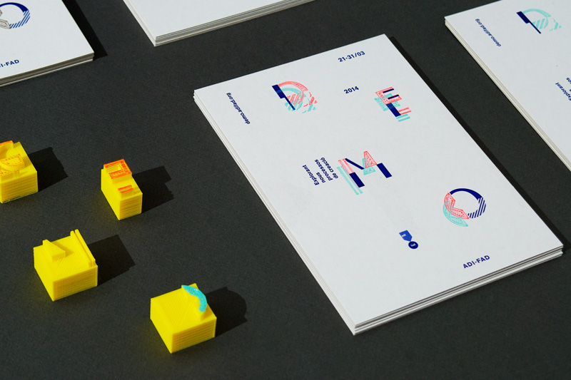
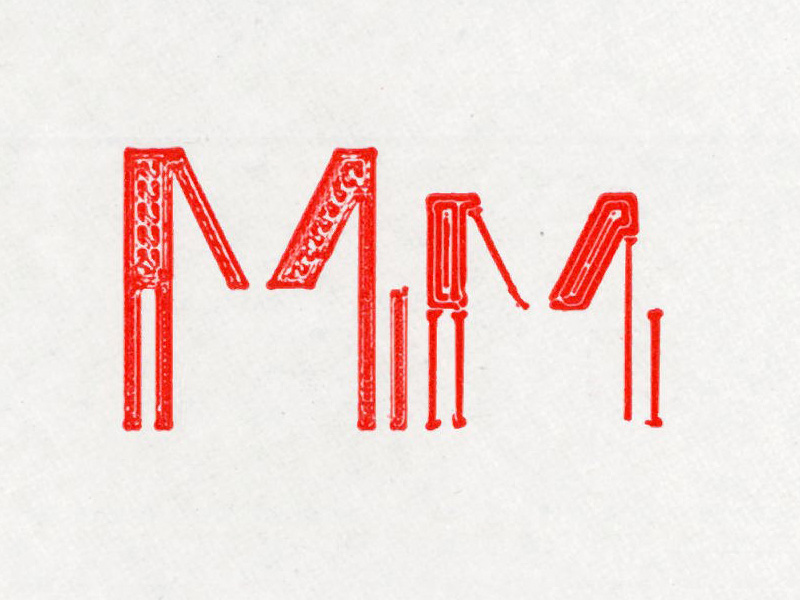
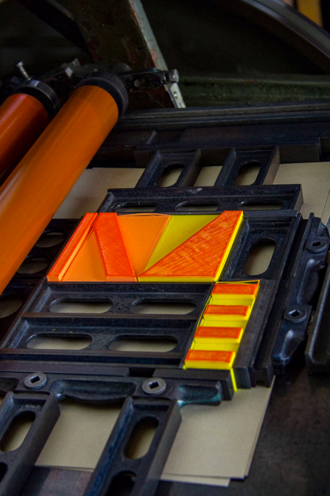
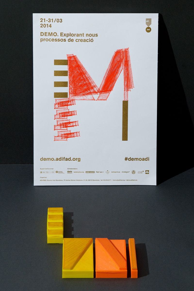
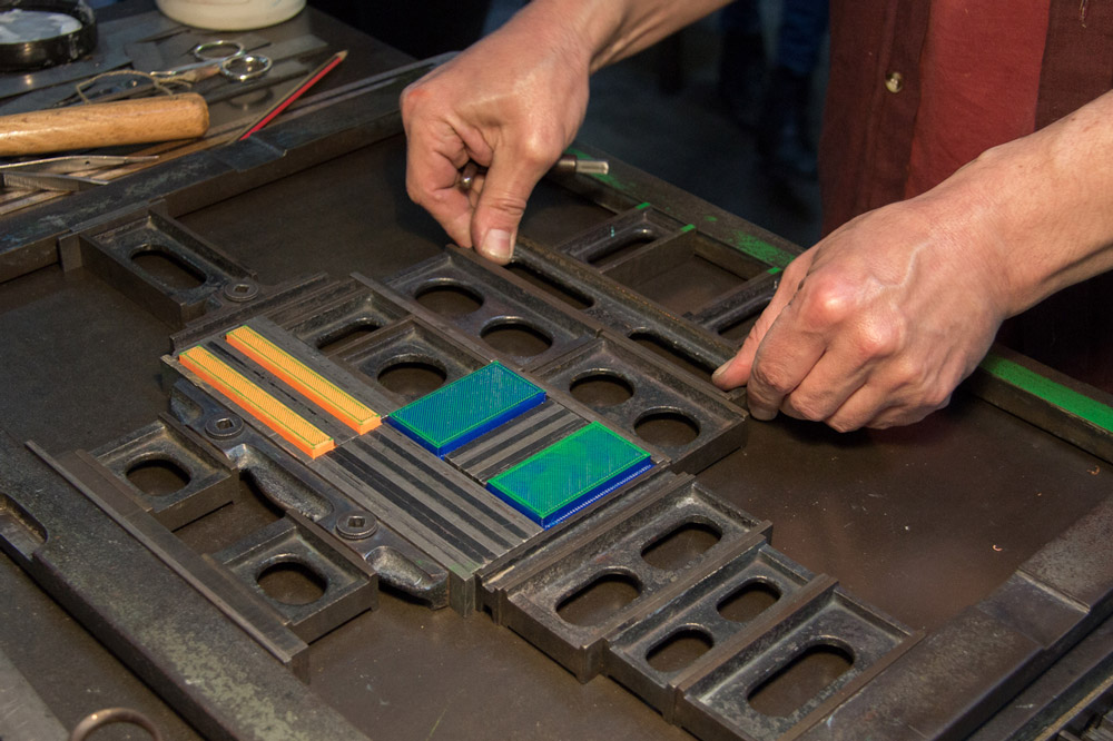
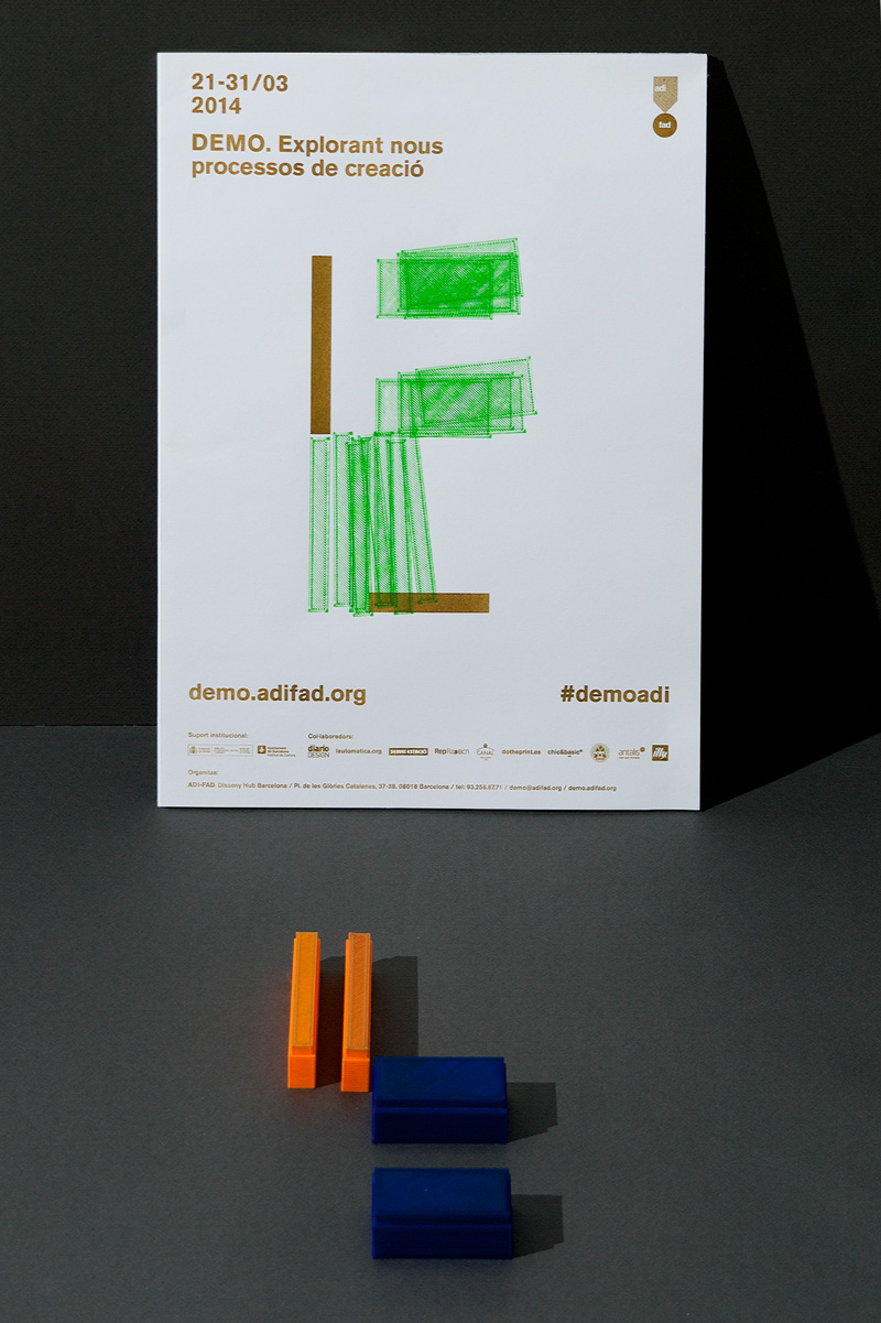
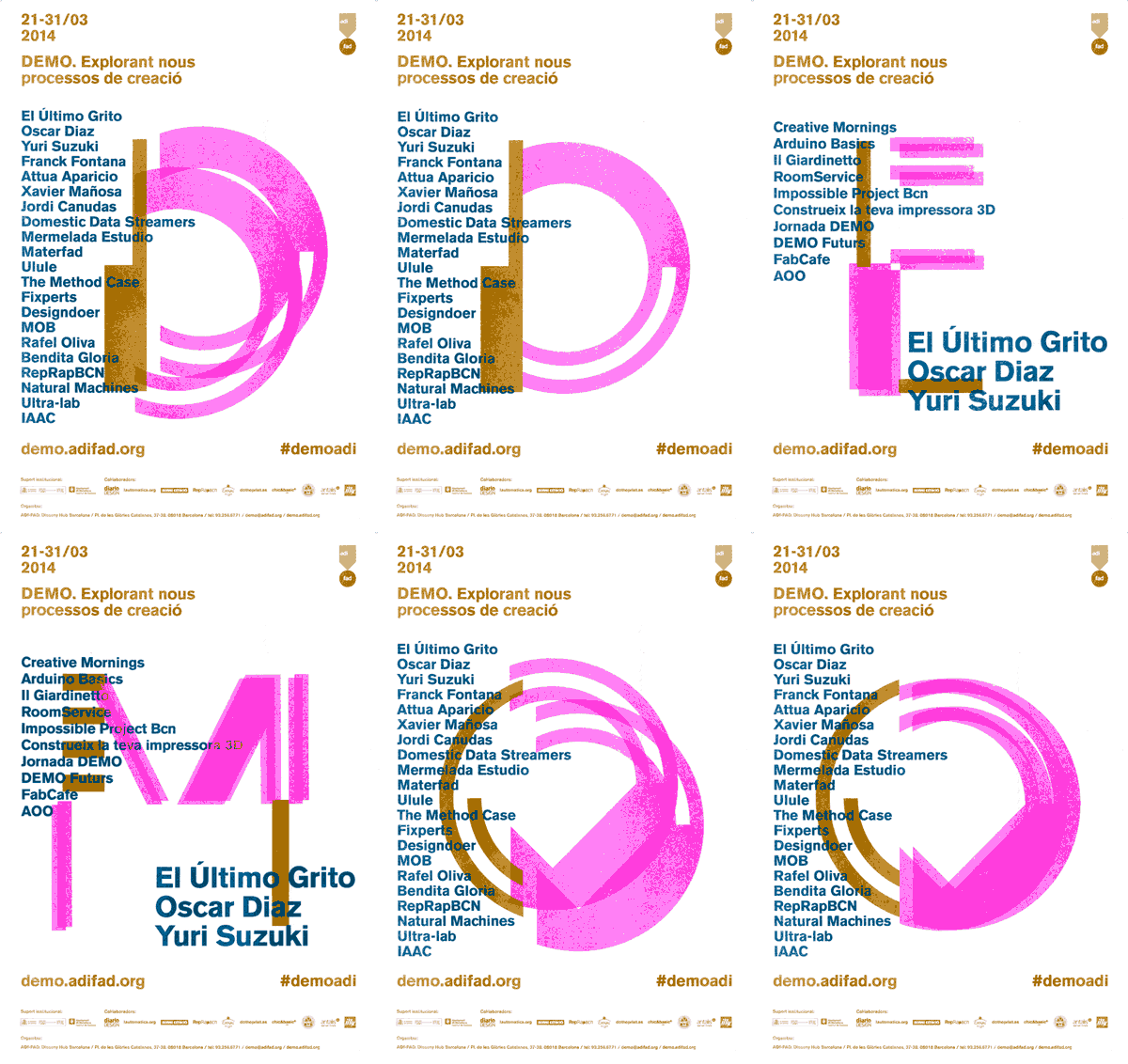
With the design of a modular-based typography, a highly flexible system was devised to combine analog and digital processes as the foundation of the event's identity. This allowed for the generation of infinite alphabets and the use of a mix of high and low-tech tools for their application in creating/producing various graphic materials. These graphic "demos" showcase the result of combining different technologies such as 3D printing, collage, risography, and traditional four-color printing.

2015
This graphic identity is connected to internet programmed by Javascript & Processing. Its nature is experimental, spontaneous, flexible & customizable.
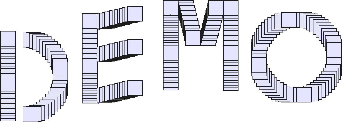

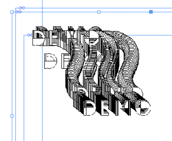
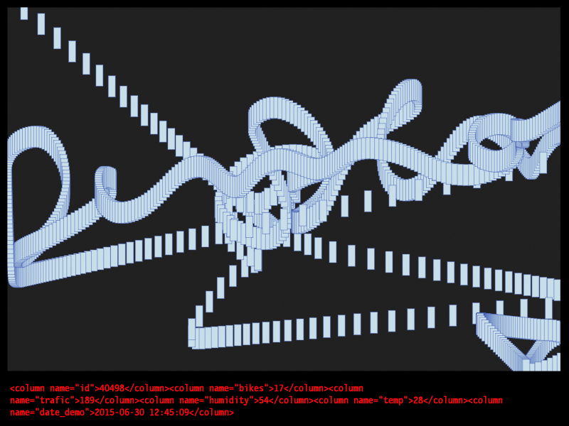
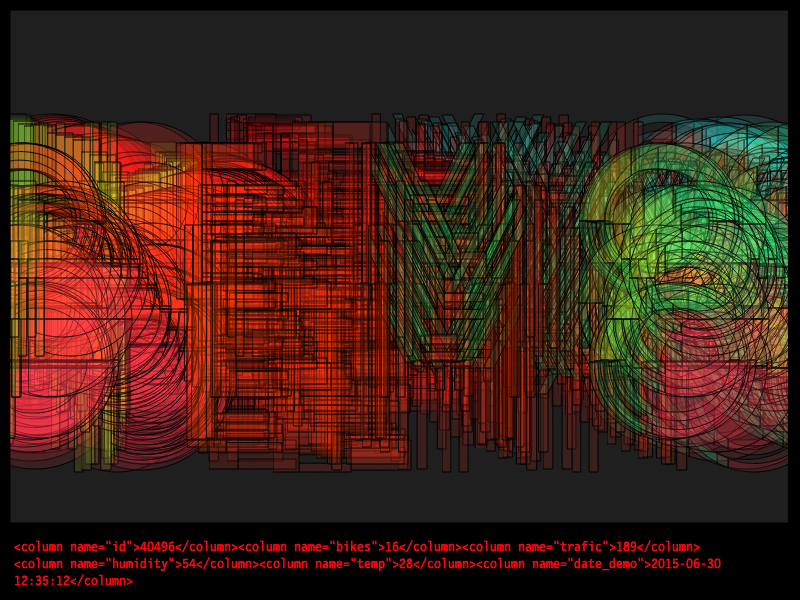
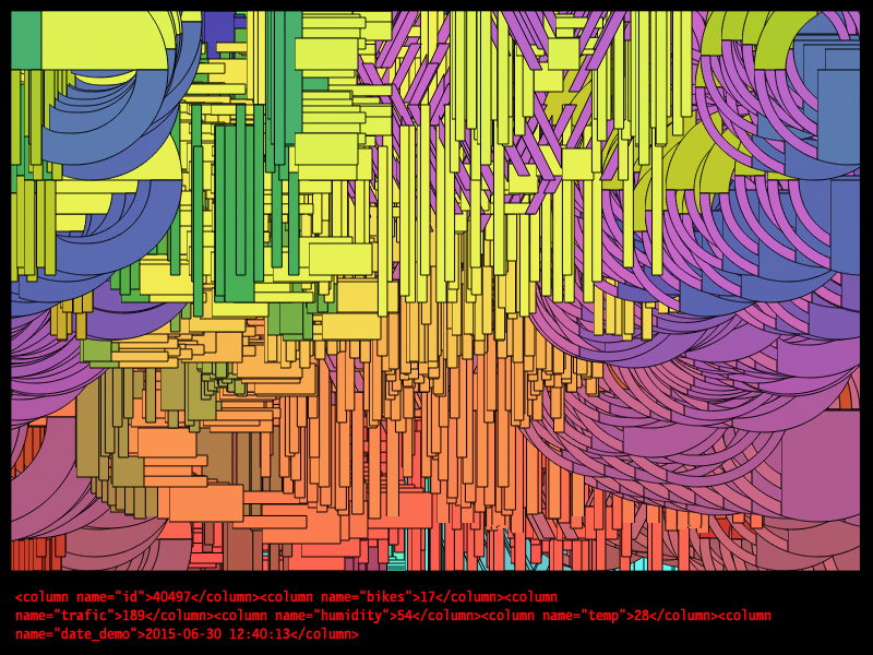
To create the new graphic identity for Demo 2015 we've connected the modular typography created for the event to the Internet using Processing and JavaScript, allowing us to generate letter shapes, positions, and repetitions based on data extracted from the Internet. Thus, humidity and temperature in Barcelona, traffic conditions at a specific time, the number of online users connected to demo.adifad.org, geolocation data, and more are some of the variables that define the graphic parameters (logo shape, color, repetition).
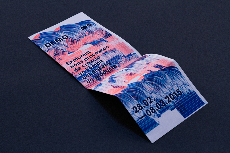
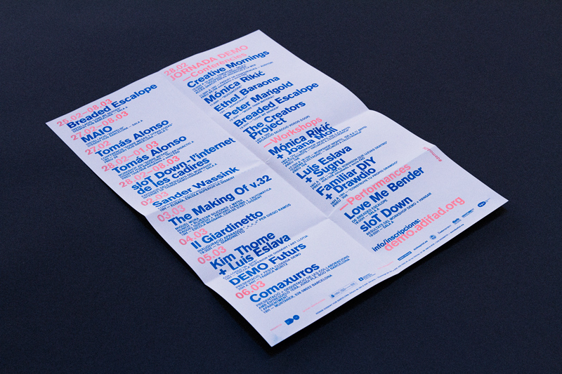
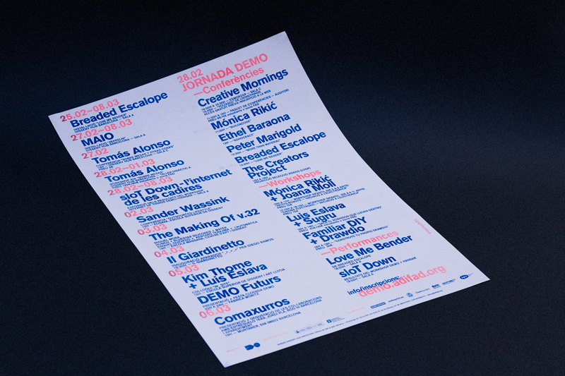
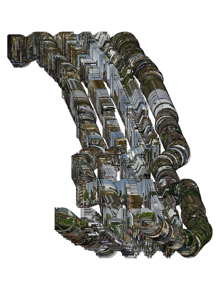
Graphics generated using geolocation data from the location of the workshops - 'Hangar,' 'Disseny Hub,'- to the studio of the teachers through Google Earth. The photos used are extracted from Google Street View cameras and showcase the visual journey from the Hangar building to the Disseny Hub building.